(Article changed on August 6, 2013 at 18:57)
(Article changed on August 6, 2013 at 18:53)
(Article changed on August 6, 2013 at 18:46)
We live in uncertain and tumultuous times. All that was certain
in our past including the stability and fundamental constitutionality of government,
the certainty that pension obligations--both public and private--would be rigorously
upheld, is now vanishing. Detroit's municipal bankruptcy places banks as secured
creditors, ahead of pensioners. In fact the riskiest obligations--derivatives,
usually based on so called "swaps", have been given "super priority" under the
2005 Bankruptcy Reform Act. (1) This maneuver seems likely to become the
template for stripping tens of millions of Americans of their pensions.
We are all familiar with the endless NSA scandals,
unconstitutional spying on all Americans--indeed upon the entire planet! Most of
us realize, at some level at least, that America has ceased to exist as the
imperfect, but fundamentally good nation that it was during our youths.
Instead concentrated wealth has completely overwhelmed its political
institutions at the national level. Similar decay is ongoing in Canada and
across the planet.
My objective today, at least, is not to dwell on any of this.
Rather, it is to demonstrate that all of the diverse phenomena related to our
political, economic, and societal decay are intrinsically related. Consider the
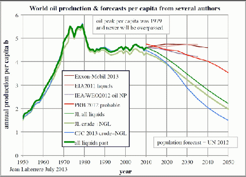
graph below. The amount of oil and other hydrocarbon liquids is shown by year,
with respect to availability per capita.
Graphed like this, we see that the peak of oil production
per person was reached in 1979. According to the graph, it has held steady for
the past 44 years, more or less, as rising production has kept pace with rising
population. Well as Mark Twain may have said: "There are lies, damn lies, and
statistics." Here, oil production had essentially flat-lined since 2005. A small
uptick has occurred mainly due to "fracking"-produced oil and natural gas in
North America.
The most essential data omitted from the above graph is
EROEI, which is an acronym for Energy Returned on Energy
Invested. Post World War II, the EROEI of oil from reservoirs such as
Gahwar in Saudi Arabia, or Spindletop in Texas, was approximately 100:1. This
means that it required the energy equivalent of one barrel of oil to produce
the energy equivalent of one hundred barrels of oil. If this EROEI were to
continue indefinitely, then the world could coast by for decades using fossil
fuels--well except of course for the human-induced climate change. However, that
is a subject for another time.
The EROEI of deepwater, polar, and other "unconventional"
sources of oil is down to about 10:1. (2) Basically, all of the "low-hanging
fruit" the easy-to-get, high net-energy oil, has already been gotten. All that
remains is the hard-to-get, hard-to-produce, stuff. The average, net EROEI of the graph just below
illustrates the effects of declining EROEI on actual net-energy availability.
Note that if this were adjusted for population as in the first graph, the
result would be declining net energy per capita globally.
Source: http://peakoil.com/generalideas/energy-part-ii-eroei
The chart just below shows the net EROEI for a number of
common energy sources.
EROEI and Cents per
kilowatt-hour
Energy mechanism
EROEI
(Note: You can view every article as one long page if you sign up as an Advocate Member, or higher).


