






This is a simple 2-year Covid deaths comparison chart for the 4 most populous states: 2 Red No Mandate & 2 blue Man… https://t.co/6MSY7Fwdws at https://t.co/6MSY7Fwdws
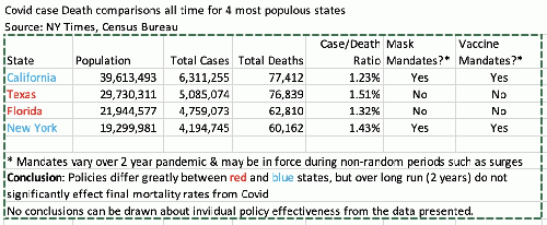
— scott baker (@NewThinking2) January 11, 2022I ran a very simple comparison of the Covid death results from the top 4 most populous states today, using NY Times Covid data (from the CDC and individual polling of the states) and Census Bureau population data.
This is what I found:
And this is what I Tweeted:
This is a simple 2-year Covid deaths comparison chart for the 4 most populous states: 2 Red No Mandate & 2 blue Mandate states. Can U see a significant difference? I can't. #endcovidmandates #covid #covidisendemic #returntonormal @CDCgov @DrFaucis1 @POTUS
Maybe a statistician can find a significant difference in outcomes, but these could be explained by other factors too: more international airports in blue states, more warm weather outdoors in red states, etc.
But the question remains: is it worth tearing the country apart with mandates or should we learn to live with what is now a largely preventable disease, at least for the worst outcomes? Vaccines work. Masks may work, if used properly. Healthy lifestyles & weight control work (including vitamin D & Zinc) up to a point.
Lockdowns & economic hardship kill too.